
A business website design should be appealing to users. And you can make it with the right color choices. But, opting for the right color palettes for a business website is extremely hard!
There are so many fascinating colors out there, and it is overwhelming to select a few. Everyone has their favorite colors, and many people fail to apply the right colors to their website, brand logo, and other brand elements. Inevitably, they are less enchanting to people.
It causes user-friendly issues like unclear or provoking mixed feelings. Colors are a way to express your brand personality, and adopting the right website color palettes in any business is essential.
Don’t panic! The web design company will help you with advanced color scheme techniques. Sounds interesting? Let’s bump into it!
Why does a website color scheme matter so much?

Before we hop into the process of selecting a color scheme for your site, it’s essential to know precisely why your website’s color scheme is very significant. After all, you might think that content really matters, but it’s not everything. It’s not true.
People are loving content, and they are drawn to new and enticing information but have to capture customer attention first. And that website color palette comes into play.
You can drastically improve the visitor experience with your content if you choose the best website color scheme.
Explore the significance of color schemes
Create brand recognition
Your company’s online home is your website. It means you need an accurate representation of your brand. Also, it should be memorable enough that your visitor should return after their first visit.
You might be amazed to know that brand recognition will be increased to 80% due to the color scheme. A web design agency will help you create publicity in the customer’s mind that results in an increase in trust towards your brand.
Your web design will act as a snap-in user’s mind, and they make a judgment accordingly for your brand.
Frame your visitor’s view
The initial assessment of the brand means the first impression is 90% based on color alone. If you want to deal with these quick judgments, you can take web design services that follow advanced color techniques and know the psychology of colors.
Color personifies meaning and emotions. You need to choose what emotions your customer will feel when they visit your website. Let’s say, if you have a grocery business, then the color green would induce the feeling of freshness, health and symbolize nature. Color solitary will motivate customers to buy vegetables or food supplies from their website.
If your brand is a tech company, blue, white, and grey colors signify innovation, advancement, precision, and related to the industry. However, it’s the best practice to increase conversation. Every color has a story behind it, so your brand must carefully select what image they want to build.
Accentuate brand elements
Do you want your specific objects to get the proper attention? The right color will help to stand out and make it more likely to be noticed. And it results in selling specific products/services. So it’s preferable to have one base color that is attention-grabbing and paired with subtle supportive colors.
2021 Encounter with the best color scheme
Shades of Red with muted tones
One of the best colors for trendy and eye-catching websites is red. It is a popular color incorporated with several brands. And the reason behind it is a dynamic color. It adds excitement to a webpage. If you pair red with muted tones, it creates an aesthetic color scheme. And it works in creating and attracting people.
Softer tunes
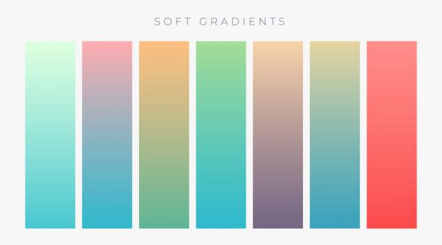
Nowadays, brands are taking their business to the next level by adopting a soft color scheme on their website. San Antonio web design companies work overall on theme and design and offer enough space to focus on your product and services.
Many customers enjoy jerking designs. It also increases user engagement due to the sophistication and classiness of the website. Soft tones are best suited to fashion-related websites. You can easily accentuate clothes, accessories, shoes, and jewelry in the presence of soft and subtle background colors.
Pink and Black
People opt to write content in black for clarity and visibility. It is a great way to allure your audience by pairing back fonts with bright color schemes. And the shade of pink is a great example. It draws attention and makes a huge aesthetic appeal.
However, it is believed that it is feminine color and often relates with only female customers. But it is far from the truth. It attracts all genders because it is chic, modern, and artistic.
Wrapping up:
Brands can choose different color schemes in order to stand out that haven’t been used before in their niche/industry. When web design companies design the website, they ensure that the color palette they select will resonate with brand image and customers. You need to choose website color palettes that grab the customer’s attention during the visit to the webpage.
Test new colors and see if customers are interested or not. If not, we simply swap it with a new design and theme. Time and opportunity should be given to make your site as charismatic and memorable as possible.


